Introduction to CSS Centering
Centering elements is one of the most common challenges in CSS. Whether it’s text, images, buttons, or entire containers, knowing the right centering techniques can drastically improve your layouts and user experience. This article explores multiple CSS approaches to center anything both vertically and horizontally with clean and maintainable code.
Why Centering Matters in Web Design
Centering content effectively creates visual balance and draws user attention. It’s crucial not only for aesthetic appeal but also for responsive designs across different screen sizes and devices.
Common CSS Centering Techniques
1. Text Alignment with text-align
The simplest way to center inline content like text inside a block element.
- Use
text-align: center;on the parent container. - Works well for headings, paragraphs, and inline elements.
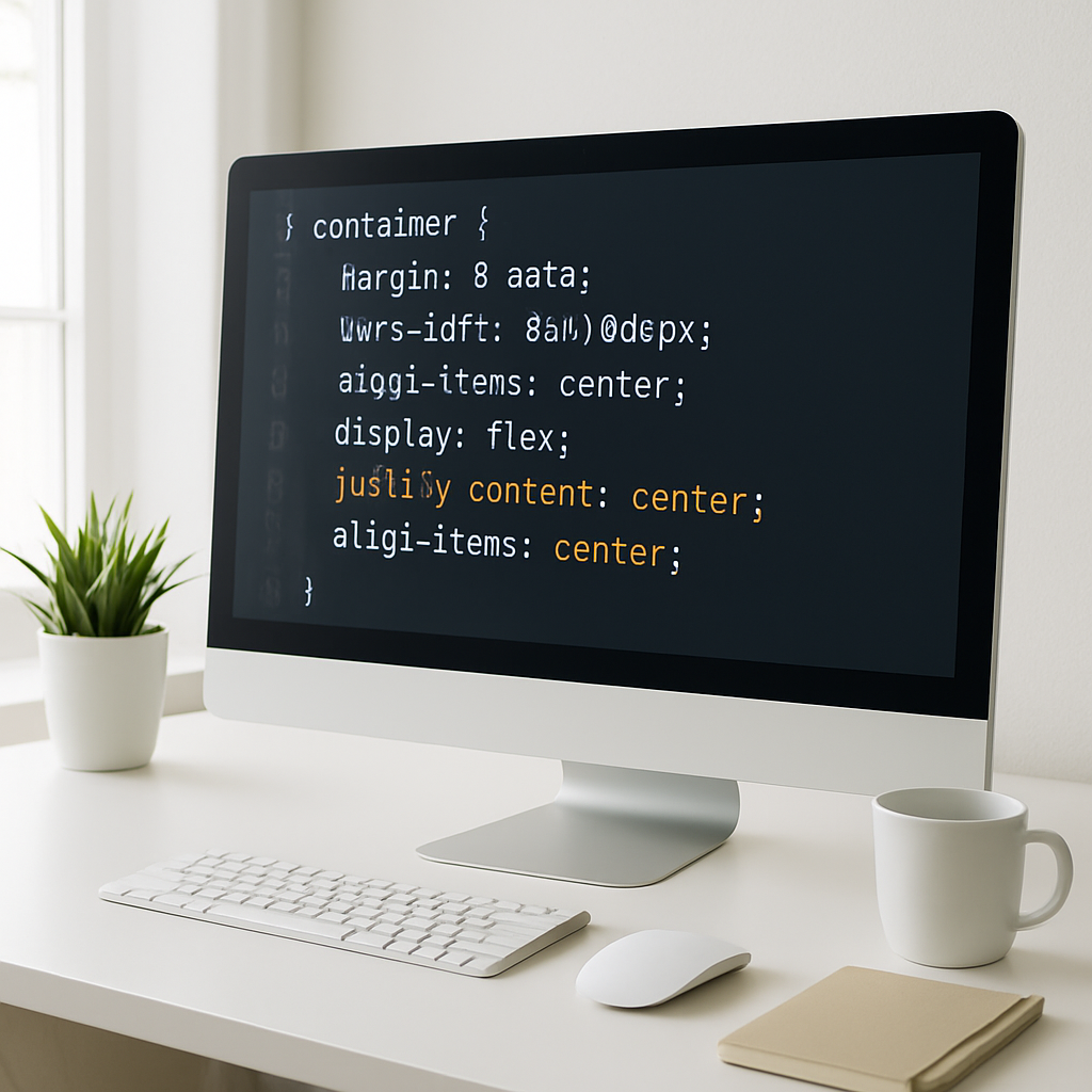
2. Using Flexbox for Precise Centering
Flexbox is modern and highly flexible for centering both single and multiple elements horizontally and vertically.
- Set the container to
display: flex; - Use
justify-content: center;to center horizontally. - Use
align-items: center;to center vertically. - For full centering:
display: flex; justify-content: center; align-items: center;
3. Grid Layout Centering
CSS Grid makes centering grid items effortless with its alignment properties.
- Set the container to
display: grid; - Use
place-items: center;to center content both vertically and horizontally.
4. Absolute Positioning and Transform
Using absolute positioning combined with CSS transforms is reliable for centering elements inside a positioned container.
- Set the parent to
position: relative; - Set the child to
position: absolute; top: 50%; left: 50%; - Apply
transform: translate(-50%, -50%);on the child - This centers the element perfectly both ways.
5. Margin Auto for Block Elements
Horizontal centering for block-level elements with a fixed width is straightforward using margin auto.
- Set a width for the element
- Apply
margin-left: auto;andmargin-right: auto; - This centers the block horizontally
Choosing the Right Method
Each method serves different scenarios:
- Text-align: Best for inline content inside blocks
- Flexbox: Ideal for flexible and dynamic layouts
- Grid: Excellent when working with grid systems
- Absolute positioning: Useful for overlay elements or specific cases
- Margin auto: Classic solution for fixed width block elements
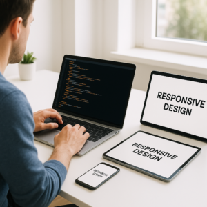
Practical Tips for Responsive Centering
- Use relative units like percentages, em, or rem for better scalability.
- Combine flexbox with media queries to adjust alignment on smaller screens.
- Test centering on different devices to ensure consistent user experience.
Conclusion
Mastering these CSS centering techniques empowers you to handle almost any layout challenge smoothly. Whether you need simple text centering or complex vertical and horizontal alignment, these methods provide robust and modern solutions. Experiment with flexbox and grid for the most flexible and maintainable codebases. With these tools, your designs will be both visually appealing and user-friendly.