Introduction to Responsive Design
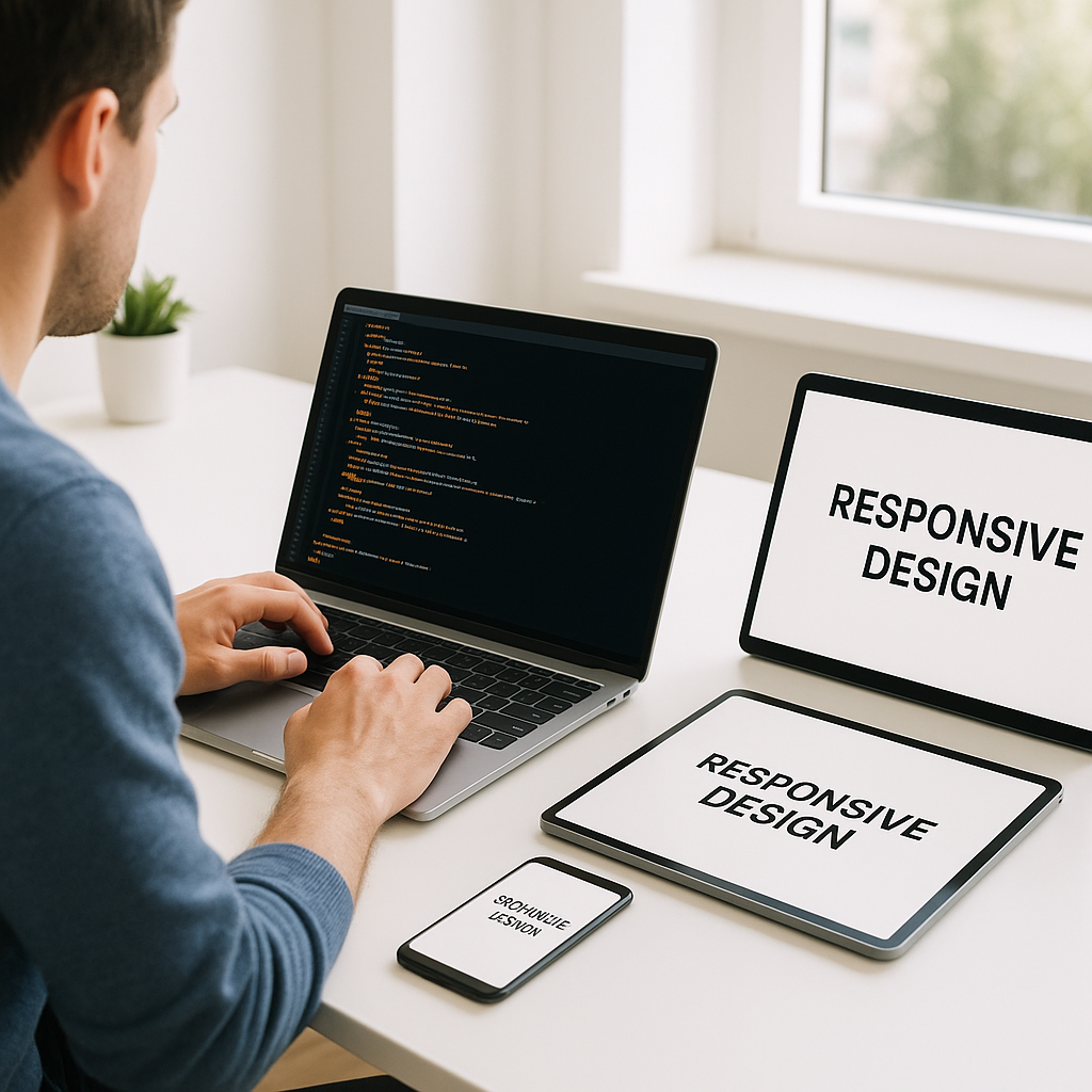
Responsive design has become a crucial practice for web developers and designers aiming to deliver seamless user experiences across diverse devices. With the rapid growth of mobile and tablet usage, websites must adapt fluidly to various screen sizes and resolutions. This article dives into the core concepts of responsive design, focusing on media queries and the mobile-first approach, two fundamental tools for building flexible, performant websites.
Understanding Media Queries
Media queries are a critical CSS feature that enables you to apply different styles depending on the device’s characteristics, such as screen width, height, orientation, and resolution.
Key Features of Media Queries
- Conditional CSS Application: Styles apply only if the given conditions are met.
- Screen Adaptability: Tailor layouts for smartphones, tablets, laptops, and desktops.
- Performance: Loading only the relevant styles ensures faster page rendering.
Basic Syntax
Media queries are added using the @media rule in CSS. For example:
@media (max-width: 768px) {
  /* CSS rules for screens 768px wide and smaller */
}
This rule targets devices with a screen width of 768 pixels or less, commonly including tablets and mobile phones.
The Mobile-First Approach Explained
Designing with a mobile-first mindset means starting the CSS development focusing on the smallest screen sizes and then progressively enhancing the design for larger devices. This approach contrasts with the traditional desktop-first method and offers several benefits:
- Improved Performance: Mobile devices load lightweight initial styles without unnecessary desktop-specific styles.
- Better User Experience: Ensures mobile users get optimized content and functionality right from the start.
- Scalable Design: Easier to add features and adjusted layouts as screen real estate increases.
How to Implement Mobile-First CSS
The main CSS code handles the styles for the smallest screens by default. Media queries then add or override styles at larger breakpoints. Example:
/* Base styles for mobile devices */
body {
  font-size: 14px;
  padding: 10px;
}

/* Styles for tablets and larger devices */
@media (min-width: 768px) {
  body {
    font-size: 16px;
    padding: 20px;
  }
}
Setting Effective Breakpoints
Choosing breakpoints is crucial in responsive design strategy. Instead of designing for specific devices, breakpoints should align with the natural layout shifts of your content.
- Content-Driven: Identify when your design breaks or requires adjustment.
- Common Breakpoints: 320px (small mobiles), 480px (large mobiles), 768px (tablets), 1024px (small desktops), 1200px+ (large desktops).
- Flexible: Use relative units such as em or rem instead of fixed pixels for more adaptability.
Best Practices for Responsive Design
- Use Fluid Grids: Employ relative units like percentages for widths instead of fixed pixels.
- Flexible Images and Media: Ensure images scale within their containers using max-width: 100%.
- Test Across Devices: Continuously validate your design on real devices and emulators.
- Optimize Performance: Minimize CSS and JavaScript to maintain fast load times on mobile networks.
Conclusion
Mastering media queries and adopting a mobile-first approach are essential steps to creating responsive websites that provide excellent user experiences regardless of device. By beginning with mobile styles and progressively enhancing your design, you ensure your website is both efficient and flexible. Incorporate these strategies to future-proof your projects and meet modern web standards with confidence.