Understanding CSS Positioning: An Essential Guide
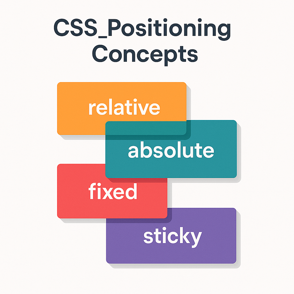
CSS positioning plays a crucial role in how elements are displayed and interact on a webpage. Mastering relative, absolute, fixed, and sticky positioning not only improves layout control but also enhances user experience. In this article, we’ll explore each of these positioning methods with practical examples to give you a complete understanding.
1. Relative Positioning
Relative positioning moves an element relative to its normal position in the document flow.
Key Characteristics:
- Does not remove the element from the document flow.
- Offsets are relative to the element’s normal position.
- Can shift element up, down, left, or right using
top,bottom,left, orright.
Example:
.box {
  position: relative;
  top: 10px;
  left: 20px;
}
This moves the box 10 pixels down and 20 pixels right from where it would normally appear.
2. Absolute Positioning
Absolute positioning removes the element from the document flow and positions it relative to its closest positioned ancestor.
Key Characteristics:
- Element no longer affects or is affected by other elements regarding layout.
- Positions are relative to the nearest ancestor with a position other than static.
- Uses
top,right,bottom, andleftfor precise control.
Example:
.container {
  position: relative;
}
.child {
  position: absolute;
  top: 0;
  right: 0;
}
Here, the child element is anchored to the top-right corner of the container.
3. Fixed Positioning
Fixed positioning positions the element relative to the viewport, so it stays in place even when scrolling.
Key Characteristics:
- Element is removed from document flow.
- Fixed to the viewport, unaffected by scrolling.
- Uses
top,right,bottom, andleftto specify position.
Example:
.navbar {
  position: fixed;
  top: 0;
  left: 0;
  width: 100%;
}
This keeps the navigation bar fixed at the top of the screen at all times.
4. Sticky Positioning
Sticky positioning toggles between relative and fixed based on the scroll position.
Key Characteristics:
- Acts as relative until the element crosses a threshold defined by offsets.
- Becomes fixed once the threshold is reached during scrolling.
- Useful for headers, table of contents, or any element that should stick in view.
Example:
.header {
  position: sticky;
  top: 0;
  background-color: white;
}
The header sticks to the top of the viewport when you scroll past it.
Summary of Positioning Differences
| Position | Removes From Flow | Position Relative To | Scroll Behavior |
|---|---|---|---|
| Relative | No | Normal position | Scrolls normally |
| Absolute | Yes | Closest positioned ancestor | Scrolls normally |
| Fixed | Yes | Viewport | Does not scroll |
| Sticky | No (initially) | Nearest scrollable ancestor | Switches to fixed on scroll |
When to Use Each Position
- Relative: For small shifts without disrupting layout.
- Absolute: For precise placement inside a container.
- Fixed: For persistent UI elements like headers or navbars.
- Sticky: For elements that should stick during scrolling but remain relative initially.
Practical Tips
- Always set a positioned ancestor (relative, absolute, or fixed) when using absolute positioning.
- Combine sticky positioning with proper container overflow settings to ensure it works correctly.
- Use fixed positioning sparingly to avoid covering important content on smaller screens.
- Test your layouts on various devices and screen sizes for expected behavior.
Conclusion
Understanding CSS positioning methods is fundamental for creating dynamic, responsive layouts. By mastering relative, absolute, fixed, and sticky positions, you can build intricate designs that behave predictably. Experiment with each type and use the examples provided to tailor your webpage layouts for better user experience and visual appeal.